Friday, February 27, 2009

Pin


Pin, 2008
Acrylic on pin, 2" x 2"

This is the first in a series of wearable art. This little acrylic landscape is on a pin. I thought this might be an inexpensive way for people to enjoy art. When I wore this piece myself the first responses were positive. This pin has a coat of medium, but future pieces will be varnished for a clearer surface.. The pin is signed on the back.

Thursday, February 26, 2009

Woman


"Woman", 2009
Prismacolor colored pencil on Stonehenge paper, 6 1/4" x 3 1/4"

This portrait was done from a photo that's not mine and therefore is considered a practice exercise. The woman and her attire are striking. This is a small piece, but it took many layers of colored pencil to complete.

Wednesday, February 25, 2009

Photo References

I use my own photo references for most of my paintings. The photographs provide me with a "sketch" of the light of the moment and a record of what drew me to the scene. It is important to experience the scene yourself to be able to recall all parts of how the light, textures, and shapes excited you.
Using photos must be done with care, and I continue to learn. A camera records all the details with everything in sharp focus. As an artist I'm learning to keep the sharpest detail and greatest contrast in my focal point. I provide less detail and softer color in the background to develop the aerial perspective.
A camera can distort your image and create perspective problems. I found this especially so when doing closeups of subjects.
Sunsets are particularly challenging to photograph. The sky is so bright and the land dark. I've learned to take many photos of a subject. I take a photo of the entire scene, one of the sky, one or more of the land (the camera's light meter adjusts to the low light and provides detail in the shade), closeups for details, and different angles. I photograph the scene in horizontal and vertical format. I can take a camera memory stick full of photos and may have one suitable photo or need to use parts of several different photographs for a final composition. I may make further adjustments using Adobe Photoshop on the computer.

Frog with a Worm


"Frog with a Worm", 2008
Prismacolor colored pencil on Stonehenge paper, 9 1/2" x 8"

This piece is from a photo in a children's nature magazine. It is not my photo and the piece could not be sold as an original work. I publish it on this blog only as an example of my practice and my learning progress. The frog had so much character and the picture was so humorous, I could not help but draw it. I simplified the background in the drawing so the entire focus would be on the frog and his meal.
I began with a very light pencil drawing, then lightened that drawing using a kneaded eraser. The image was created with many light layers of Prismacolor colored pencil in tiny circular strokes. The final bright highlights were done with small dabs of gouache.

Birches


"Birches", 2008
Watercolor and Micron pen on watercolor paper, 7" x 5"

This image is from my imagination. My intent was to just have fun with the water color and pen, and I enjoyed doing this quick sketch.

Provincelands


"Provincelands", 2008
Pastel on Strathmore charcoal paper, 10" x 21"

This painting of the sand dunes along Route 6 in Provincetown, MA was done using my reference photo.
The water's surface is a challenging exercise. Reflections appear where the water is flat and undisturbed by the breeze, but the reflections lack some detail. Lights appear darker and darks appear lighter in the reflection. I try to paint what I see when I look at the scene and the reflections, not what I know to be water.

Monday, February 23, 2009

Last Ice


"Last Ice", 2008
Pastel on Strathmore paper, 10" x 14"

This painting was done using my reference photo taken in the late afternoon. The setting sun was just catching the tree tops and shoreline across the cove.

Sunday, February 22, 2009

Trout Brook Path


"Trout Brook Path", 2008
Pastel on Canson paper, 8" x 10"

This pastel painting was done from a reference photo taken at a favorite hiking spot. The light is what draws me to many subjects, and the dappled sunlight along the path was what I wanted to capture here.
The painting was part of the 2008 Greenways Four Seasons exhibit that toured three towns over a period of months.

Rose-breasted Grosbeak


"Rose-breasted Grosbeak", 2008
Pastel on Strathmore paper, 13" x 9"

As I painted the bird's feathers, my goal was to achieve the most realistic image that I could.
There are many beautiful birds that come to our feeders throughout the year including the colorful male rose-breasted grosbeak and his less distinctive brown and white mate. The grosbeaks summer where we live.
This pastel painting won First Place and Reserve Champion in the 2008 Sterling Fair. This painting was also part of the 2008 Greenways Four Seasons exhibit that toured three towns over a period of months.

Wednesday, February 4, 2009

Spring Pasture


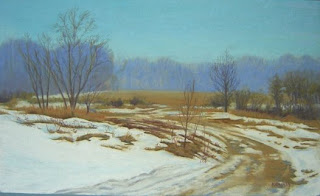
"Spring Pasture", 2008
Pastel on Strathmore paper, 9 1/2" x 16"

This painting is part of the farm series. The wagon road caught my attention as I was driving by. It pulls you into the scene. I worked in the compliments of orange and blue.
Artist/authors state the absolute importance of planning before beginning a painting. Much of my compositional and color planning is done in Adobe Photoshop on the computer. The graphics editing software allows me a lot of image control and manipulation possibilities. My color choice is usually close to the local color of the scene that I experienced and photographed.
Recently, I read Margaret Kessler’s “Color Harmony in Your Paintings” in which she stresses the importance of pre-painting planning. She writes about composition, value, and color planning. She also uses photo references, but decides the color scheme before beginning to work. In her work she may change the color scheme completely, even making a summer view into an autumn painting or a cool color scheme into a warm one. The color scheme of the painting is dependent on the feeling she wants to express. She says that using a complimentary color scheme will “create visual excitement through contrast”. By placing complimentary colors beside one another the artist can “create a strong focal point” in the painting. She does recommend that the artist emphasize one of the compliments over the other.
I am beginning to "stretch" the local color of a scene, but I have work to do to achieve more expressive colors over realistic colors.

Tuesday, February 3, 2009

Storm Hill Farm


"Storm Hill Farm", 2008
Acrylic on canvas, 11" x 14"

This acrylic painting is part of the farm series. The photo reference was taken at Storm Hill Farm, Princeton, MA on Farm Day. This was a tour of participating farms sponsored by the Princeton Agricultural Commission, Audubon, and the Princeton Art Society.
This painting was part of the 2008 Greenways Four Seasons exhibit that toured three towns over a period of months.
"Storm Hill Farm" won First Place in acrylic painting and Champion in the 2008 Sterling Fair.

Monday, February 2, 2009

Rock Harbor 4th of July


"Rock Harbor 4th of July", 2008
pastel on Strathmore paper, 18" x 16"

The reference photo for this painting was taken on the beach at Rock Harbor, MA on the 4th of July. The colors of the sunset are Nature's fireworks.

Phoebes


"Phoebes", 2008
pastel on Strathmore paper, 7" x 10"

This painting is from a reference photo taken from our kitchen window. Each year the phoebes return to nest under our eave just feet from this vertical cranberry bush. These babies are from the summer's brood on their first flight.

Sunday, February 1, 2009

The Blacksmith

"The Blacksmith", 2008
pastel on Strathmore paper, 18" x 14"

This portrait is part of the farming series. Our friend is a blacksmith in Worcester, MA.

In from the Barn


"In from the Barn", 2008
pastel on Strathmore paper, 18" x 11 3/4"

This portrait is the beginning of a series of paintings of New England farming. Through these paintings I hope to show the farming community with its rich history, the connection of people to the land, and the pride and respect that farmers have for family and tradition. The classic, hand-hewn barns, live stock, and open fields are my subjects.